BedFinder

The Care Home Finder App – Case Study
SaaS B2B B2C Web App Mobile App
01-TABLET - Bedfinder

Introduction

Designing with Dignity

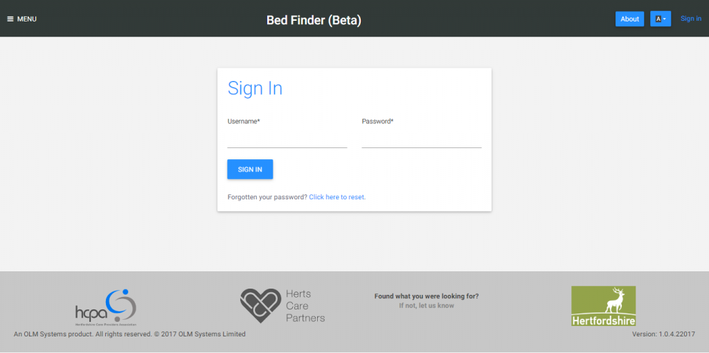
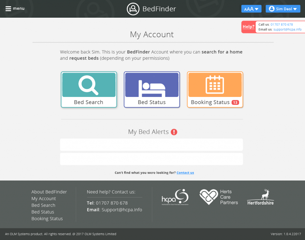
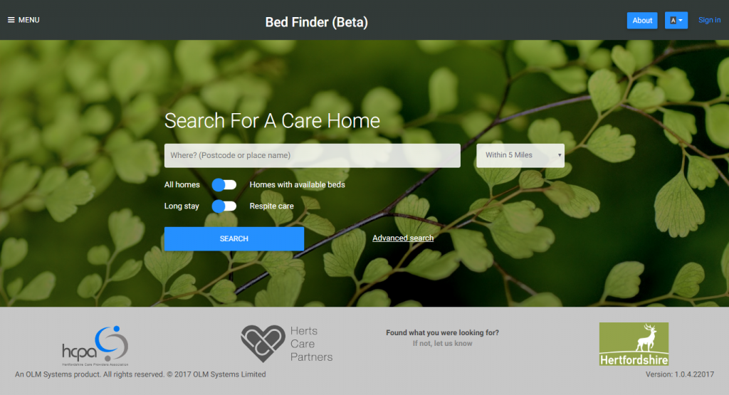
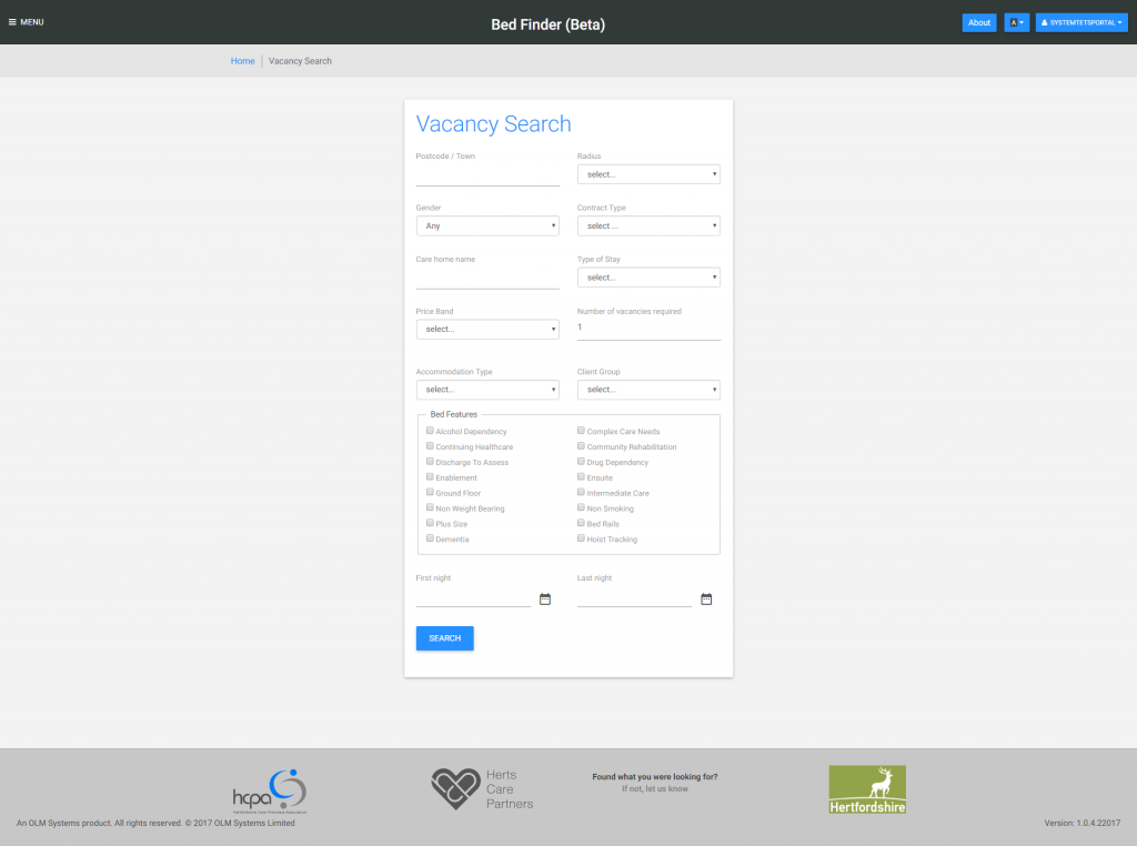
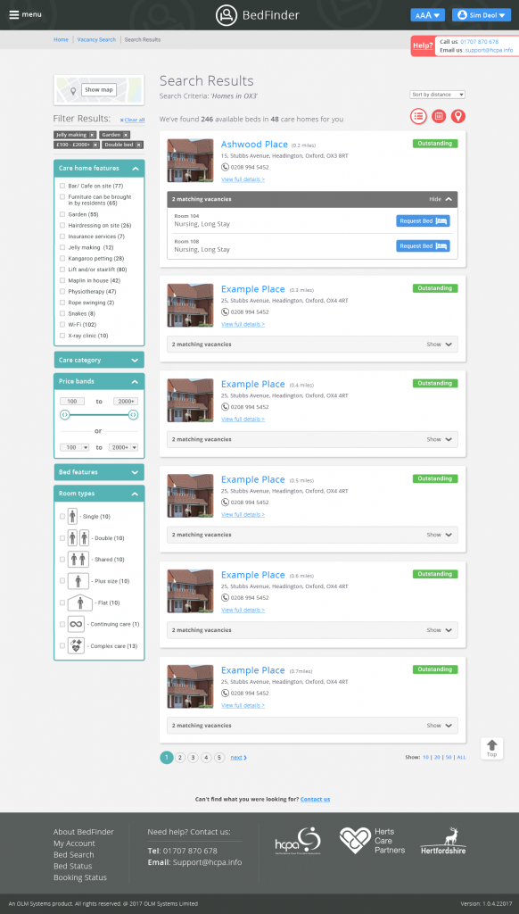
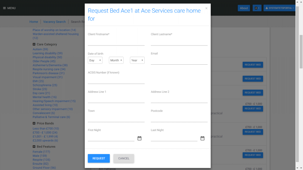
A fast-moving, high-impact project to connect vulnerable families with available care homes in real time. As the lead UX designer on Bedfinder, I helped transform a complex, emotionally charged process into a calm, focused experience. Over six months, I led user research, defined the product vision, and delivered an intuitive search interface that was accessible to users of all ages and tech fluency levels.

“If the user is having a problem, it's our problem”

The Challenge

A tool for everyone, built for a delicate moment
  • How do you create a product that serves both elderly users and tech-savvy young adults?

  • How do you reduce the emotional weight of searching for care without losing necessary detail?

  • How do you surface live bed availability without overwhelming the user?

This wasn’t just a design challenge, it was about delivering dignity, speed and clarity to people under stress.

My Role

Shaping strategy, guiding simplicity

Shaping strategy, guiding simplicity

  • Most senior of three designers; led the project end to end

  • Conducted research via on-site care home visits and stakeholder workshops

  • Defined the core user experience, from search flow to results page interactions

  • Worked closely with engineers, product managers, marketing, and the CEO

  • Tools used: Figma, InVision, Adobe Creative Suite

The Tools

For collaboration, alignment and design.

The Strategy

Balancing clarity with complexity
  • Simplified the product into a single goal: Find a care home with availability

  • Visited care homes and interviewed real users to understand pain points

  • Prioritised a streamlined search and filter system over multifunctional features

  • Led creative exploration of input methods: sliders, tags, icons instead of plain checkboxes

These changes dramatically improved engagement, especially among elderly users who were initially hesitant.

Design Highlights

Filters, clarity, and instant action

My end-to-end process included:

  • Workshop facilitation with enterprise clients
  • Competitive research
  • Built intuitive search filters inspired by travel and booking platforms

  • Highlighted the most requested info (phone number, room type, availability) on results cards

  • Created a feedback loop post-launch that revealed key areas of friction

  • Redesigned filters to reduce repetition and added visual clarity for hesitant users

  • Wireframes to high-fidelity mockups in Figma
  • Design tokens and component system development
  • Prototyping in Axure and InVision for interactive, edge-case testing
  • Engineering handoff and QA walkthroughs
Ideation/Workshops
Research
User Journey/Flows
UX and UI Web Digital Design, user journey mapping
Development

The Product

Designing a simple search for users with complex needs
Sign-in
Sign in screen
Home
Home screen
Search
Search screen
Advanced Search
Advanced search
Results
Search results
Contact
Bed request dialogue

Research and Validation

Learning from lived experience
  • On-site interviews at multiple care homes

  • Feedback sessions with younger users through UserZoom

  • Post-launch monitoring to identify usage patterns and improvement areas

  • Adjusted interaction types (e.g. sliders vs. checkboxes) based on real observed behaviour

Impact

Simple choices, meaningful outcomes
  • Positive post-launch feedback from both elderly users and their families

  • Reduced hesitation and increased filter interaction after UI overhaul

  • Internal alignment across departments led to a more cohesive release

  • Application now serves as a user-friendly alternative to more cumbersome legacy systems

  • 220+ providers registered in the first 6 months
  • 60% reduction in help-desk calls
  • 85% reduction in bed vacancy time according to the interviewed sample of providers

This is the first time I didn’t feel overwhelmed looking for care. My grandfather was even able to book care home for himself.

— User feedback

I really like the look and feel of the app. I couldn’t have found it any easier to book a suitable care home for my grandma.

— Anonymous user

What I find most impressive is the way I didn’t need any help to call some care homes near me.

— Anonymous elderly user

Reflection

Making complex feel calm

What I’m most proud of is transforming a moment of stress into a moment of ease. Whether it was a 70-year-old parent or a 30-year-old son, people felt empowered rather than intimidated. This wasn’t about flashy features, it was about thoughtful reduction, empathy, and trust. I also take pride in how I led this initiative from ambiguity to clarity, aligning diverse teams and turning a vision from the CEO into something tangible, validated, and loved.

Let’s Connect

Whether it’s your next product or team you’re building, I’d love to hear from you.
Designed with care by Sim Deol. © 2025